Client: KWENS’ TABLE Kwens’ Table (pronounced the same as “queen”) is an initiative lead by The Hamba Group. Its primary function is to serve as a monthly social group for feminine-aligned individuals to have their seat at “the table” and to be honored as queens. It has several subsidiaries such as Kwen Speaks, Kwens Collective, and just KWEN. Ultimately it is an initiative to build community.
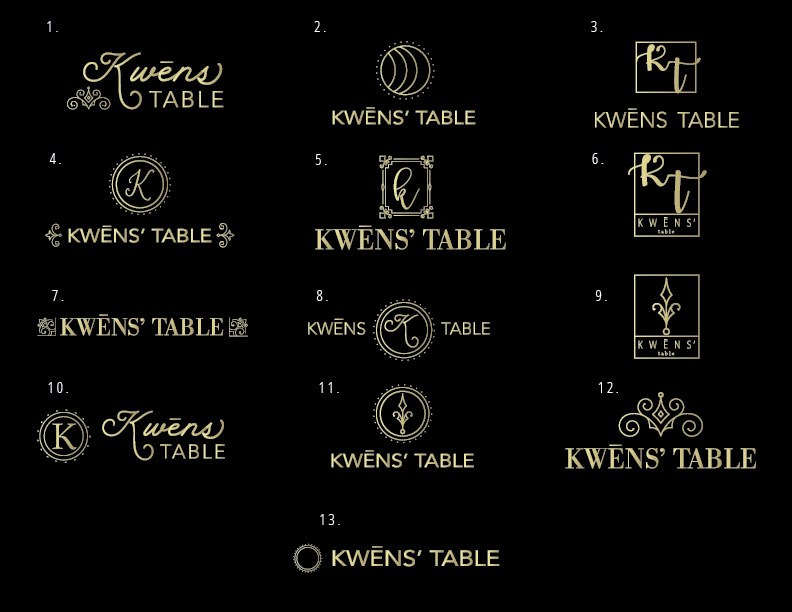
Objective: The client’s main goal was to create a logo that spoke to the nature of this initiative. They wanted a logo that also could be translated into a literal table design in the future for in-person events once their group grew larger. They also wanted this logo to be versatile enough to be used as part of their other subsidiaries.
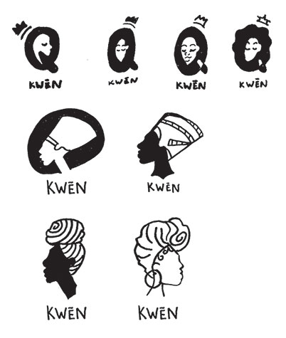
Solution: The client’s group is Black-owned, so initial concepts were oriented towards Black Queens and their “crowns” (hair, turbans, literal Egyptian Queens, ect.). After some feedback, we redirected and leaned more towards the table itself and ornate patterns as a central theme. An elegant script typeface paired with a subtle gold gradient would bring the sense of royalty that the client was looking for. Other symbolism was also pulled into the creation of the design, resulting in a beautiful and versatile logo for the initiative.